Dashboard
Project/Program Performance Dashboard
🔗 Explore the interactive dashboard here: View Interactive Dashboard
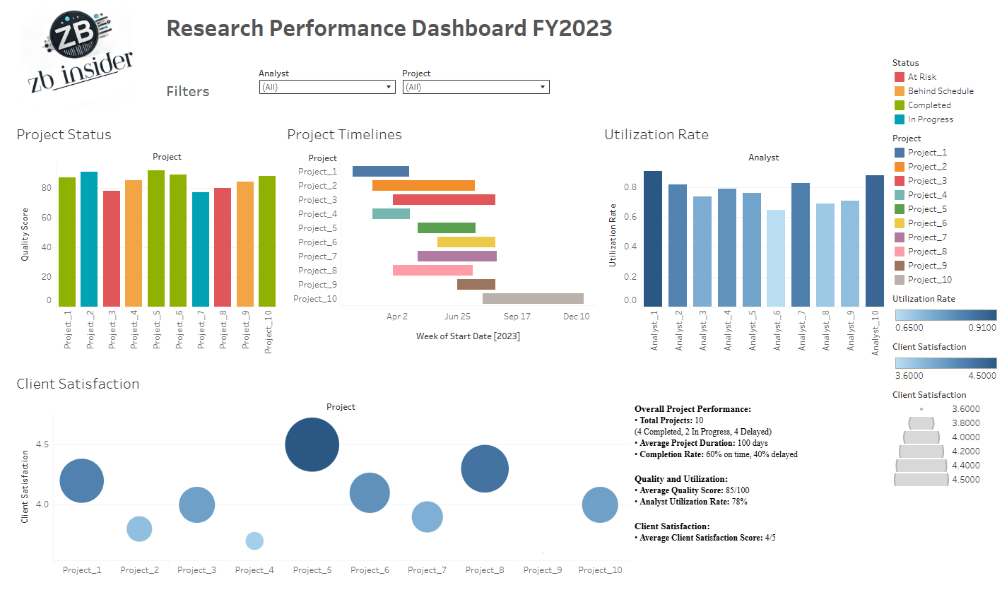
📊 Research Performance Dashboard (FY2023)
This interactive dashboard provides a detailed overview of research project and program performance for fiscal year 2023. It enables managers, analysts, and stakeholders to evaluate progress, optimize analyst workload, and improve service delivery through clear, real-time insights.
🔍 Features:
- Project Status (Top-Left): A color-coded bar chart showing project quality scores and
their statuses:
🟢 Completed, 🔵 In Progress, 🟠 At Risk, 🔴 Behind Schedule. - Project Timelines (Top-Center): A Gantt chart illustrating each project's start date and duration, helping visualize overlaps and pacing throughout the year.
- Utilization Rate (Top-Right): Analyst workload efficiency is shown through a bar chart of individual utilization rates.
- Client Satisfaction (Bottom-Left): A bubble chart represents project-specific feedback scores; bubble size reflects response volume, while vertical position reflects satisfaction level.
- Summary Metrics (Bottom-Right): Aggregated data including total projects, on-time completion rate, average duration, quality scores, and client satisfaction.
This dashboard was developed to support data-driven decision-making, resource planning, and quality assurance within the research program. It offers a comprehensive snapshot of team performance and client outcomes across multiple initiatives.